I worked on a ground-up redesign of SMART Technologies’ customer support site, leading the UX design, as part of a cross-functional group involving the web team, documentation group, marketing, customer experience and customer support departments.
Defining the Project
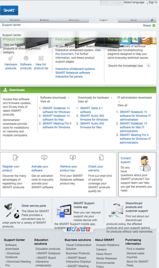
In 2015, the number one complaint customers had was not being able to find anything, due to a very dated and unplanned site structure. Text-heavy landing pages were long and unreadable; documentation wasn’t grouped in a helpful way; ad-hoc pages cluttered things further. This led to heavier demand on the SMART call centre support team. Plus, the old site wasn’t usable on small-screen devices.
Our goals were thus defined as:
- Empowering end-users to self-serve when it came to support
- Decreasing the number of calls to the support centre, lowering costs
- Redesigning it as a responsive, mobile-first, standards-compliant site
Understanding User Behaviour
As a team, we conducted over a dozen interviews with end-users from the education space, such as technology-focused teachers and educational technologists, as well as from reseller partners who supported SMART’s products in schools to learn more about what they did when they needed help.
From this research, we concluded that users had three primary task flows:
- Installing the product. For SMART Boards installed in schools, this means a good deal of pre-install preparation for adequate mounting, safety precautions, room lighting, wiring, and so on, in addition to networking, updates and software.
- Using the product. Getting connected to the SMART Board, setting the right modes, using peripherals, and learning the intricacies of SMART Notebook were just a few of the things they’d have to become fluent in.
- Troubleshooting when things went wrong. Here is where users differed the most; tech-savvy individuals would use text search to find something that matched their description, whereas others would want step-by-step instructions or to be able to call an agent. Since reducing call centre costs was a secondary goal of the project, helping users self-serve here was critical. This was also the point in the journey where the user was most likely to be stressed out.
Examining Solutions
We knew we weren’t the first to tackle this problem, so we examined comparable support websites and features from direct competitors such as Promethean, as well as leading providers of hardware and software like HP, Apple, Dell, and Google. What we found was that the best sites identified the same task flows that we had uncovered in our research, and addressed different user search styles by offering a mix of text, visual and guided options.
Critically, addressing a stressed user required understanding how people’s cognition changes under stress. Their emotions run high, they experience difficulty making decisions, and their reading comprehension drops. This is where a simplified design would help the most.
Structuring the information in a more logical way to serve these paths was key, so identifying a funnel hierarchy from general to specific, and providing intermediate places where a user might jump into the flow, would help them stay focused and keep them immediately oriented.
Prototyping
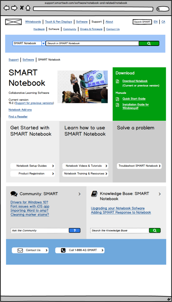
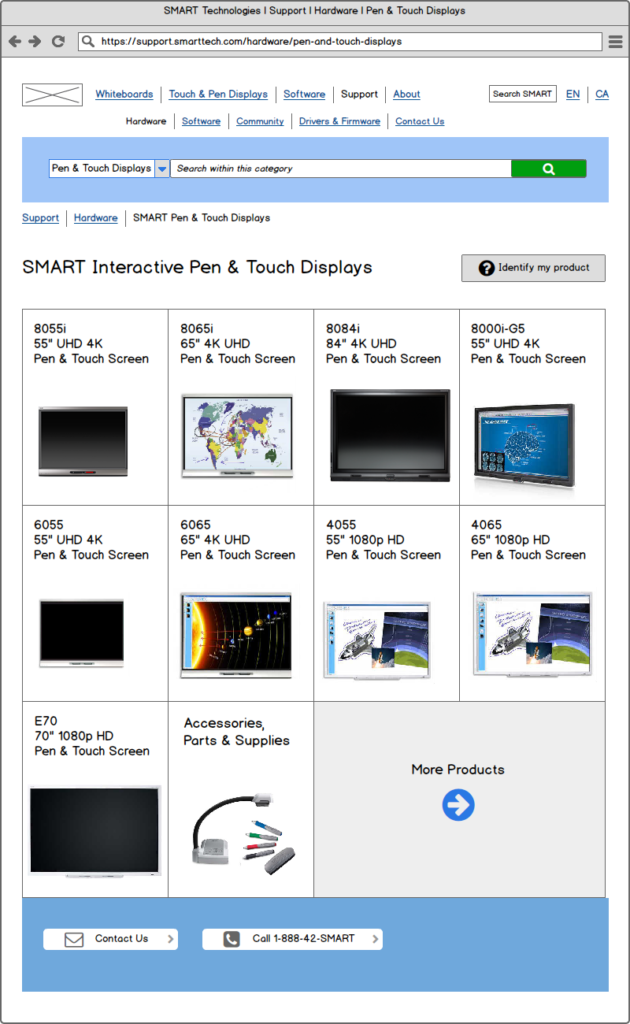
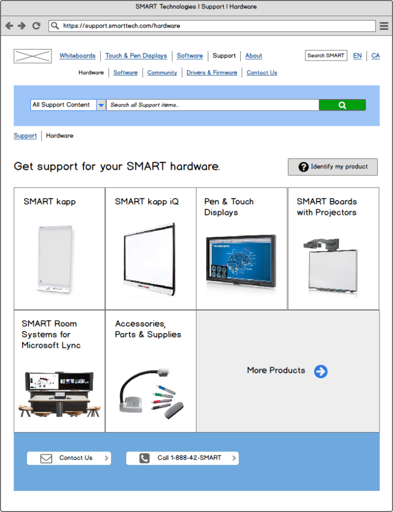
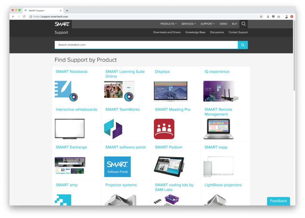
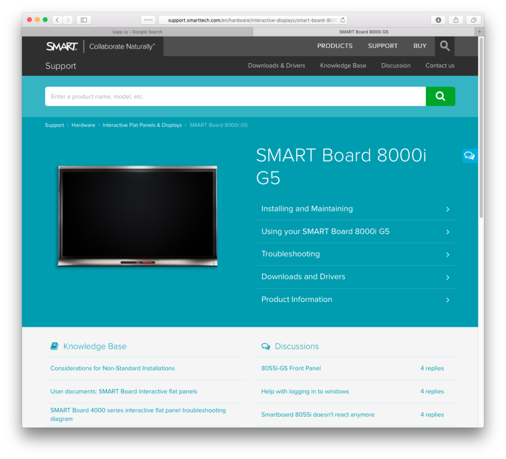
I wireframed several concepts using Balsamiq Mockups, identifying a grid of images as the best way to present different product categories and help users drill down. At the core would be a ‘product landing page’ with a large image banner and helpful buttons to guide next steps and actions, and provide links to other resources such as downloads, manuals, troubleshooting guides, and user forums.
Design
Once sets of flows and wires had been established, I began work on the visual design. I initially took color and typographical cues from the then-recently redesigned Education site, and worked with the Marketing design team to refine the concept to work with their ideas for new, sitewide black-on-black nav headers and footers.
Our core of developers translated these designs into new templates and data structures for Sitecore, the CMS that SMART uses. After many rounds of internal review and QA, we had a site that was attractive, easy to navigate, and responsive. The majority of content could be viewed on mobile devices, ideal for troubleshooters and teachers who might only have a phone to use for Internet access.
Outcomes
The launch of the site was a great success. The internal, cross-functional team that had helped create it, comprising members of the Support, Documentation, Marketing, UX and Web Development teams, were recognized by management for their efforts. In our follow-ups with the users we’d interviewed, all of them reported positive feelings and feedback on the new site and how it addressed their needs, and the Support team noted a decrease in calls to their service centre, meaning we’d achieved our goal of helping users self-serve for their support needs.