Hagopian Ink is an award-winning NYC design agency that works with luxury and global brands including Armani Exchange, Mercedes-Benz, PepsiCo and Lancôme. We created their brand-new responsive site using HTML5/CSS3, web video and SVG.
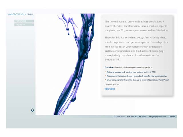
As Hagopian Ink entered their twelfth year in business, it became clear their website was no longer serving their needs. Pages weren’t easy to update without calling upon a developer; Flash-based animated backgrounds didn’t work on iOS devices. Important text content had been rendered as graphics, making it invisible to search engines and screen readers. From a content perspective, it required many clicks to get to portfolio items, and the homepage didn’t explain what they did clearly enough. A separate mobile-optimized site only offered a subset of the main content, and the desktop layout, optimized for 1024×768 screens, didn’t scale up to today’s high-resolution devices.
What We Discovered: The Research
We started the project with user and stakeholder research, in order to understand the company’s goals and requirements, and what content and features were important to Hagopian Ink’s customers.
Several former and current clients were interviewed; The common thread that emerged showed that large, clear images were the key selling factor. We also conducted extensive competitive research to understand the NYC agency landscape, identify what was done well by others, and see where Hagopian Ink could differentiate themselves.
We identified Hagopian Ink’s strength in the luxury market as a plus, but not the only area to focus on, to keep it open to related fields and industries – communicating the value derived from each project was key. In comparison to competitor sites, most didn’t offer a true responsive design; many tended towards text-heaviness and “marketese,” with only a handful daring to go with large images. These findings helped shape the design goals.
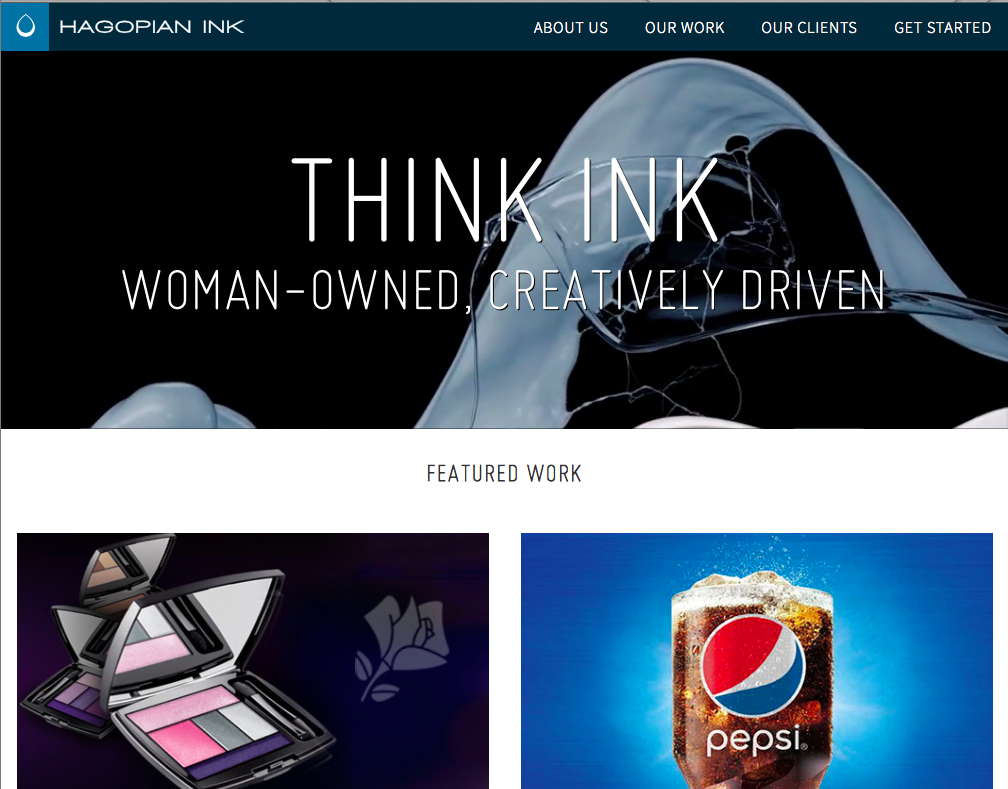
Framing the Visual Language
From a visual standpoint, the brief was to keep things minimal and clean, and to increase readability with a quiet typographic rhythm. In several rounds of discussion and iteration, in parallel with the user research, we moved from initial concepts based around modular square grids to a more cinematic, widescreen header.
We created a modulated typographic hierarchy using two typefaces, Miso for large display headlines, and Source Sans Pro for text and navigation elements.
To simplify responsive re-ordering of images, we designed modules of single and dual images that could be combined as needed, with optional captions.
The signature blue, pulled from the Hagopian Ink logo, served as a base from which lighter and darker shades were derived for use in key structural elements. Along with a small number of grey shades and gradients for section emphasis, the colour palette was kept neutral and unified, the better to play off the rich, colourful portfolio images.
The logo and wordmark were simplified, and their relative proportions and thickness tweaked for better readability at small sizes. Square versions of the logo were generated for favicons, social media profile images, and iOS and Windows Phone web-app shortcut icons.
Designing for HiDPI Performance
The old site’s bitmap icons and graphic text were replaced with accessible, modern equivalents. Now, all text was pure HTML styled using webfonts. Icon fonts addressed social media links. Main and client logos were rendered as Scalable Vector Graphics (SVG). Buttons, menus, gradients and dividing lines were rendered in pure HTML/CSS.
On the client side, Hagopian Ink prepared new high-resolution photography of their print portfolio, which we optimized with compression to download quickly. All of this ensured that the site renders crisply on HiDPI devices, while speeding up performance.
A Splash of HTML5 Video
The looped ‘paint splash’ video backgrounds for main section banners carry forward Hagopian Ink’s trademark ‘ink drop’ animated motif, conveying a sense of slow-motion texture and elegance.
Our challenge was to get them to work efficiently across different devices. We edited a selection of stock video clips to loop seamlessly, and rendered them as optimized H.264 MPEG-4 and WebM clips for desktop browsers. Shorter loops were rendered as GIFs for mobile devices, to get around the restriction mobile devices have on auto-playing videos. Finally, as a fallback for older devices or slow connections, a JPEG of the video’s initial frame is set as the video container’s background; once the video loads, it smoothly transitions into motion.

Content Strategy, Copywriting and SEO
We brought in J.M. Henderson, noted writer for Forbes and The Atlantic and founder of Secret Agent Research to conduct the stakeholder interviews and handle copywriting.
Her research identified not just client concerns, but also revealed the words and phrases clients used to describe their problems. She incorporated this into dozens of pages of revised text content, including brand-new case studies for work that was previously unpublished.
A forthcoming update will add a blog for news updates and articles, and as part of that, we’ll be guiding Hagopian Ink with content planning for blog posts, social media and public relations strategy.
From a search perspective, we enabled SEO tools that make it easy to add and edit keywords, description text, and test for adequate content length. This helps content to appear with relevant snippets and images in search results, and on the back end, generates sitemaps in a Google-friendly XML format. Microcopy and HTML5 link attributes make it easier for search engines and mobile devices to pick up addresses and phone numbers directly from site text.
From Design To Code
The new site was built on WordPress, and hosted at WPEngine, a specialty provider that offers added security, staging, backup and Content Delivery Network (CDN) features.
Our director of UX, Clarissa Peterson, handled coding duties. Working from the design guidelines, she crafted a custom HTML5/CSS3 responsive WordPress template system for the new site, designed from scratch to work across desktop, tablet and smartphones, with accessibility in mind, and using only minimal Javascript for backwards compatibility with older browsers.
This involved establishing a content-out style guide; refining layout and typographic hierarchy for different devices and aspect ratios, all while balancing mobile performance and Retina / HiDPI compatibility.
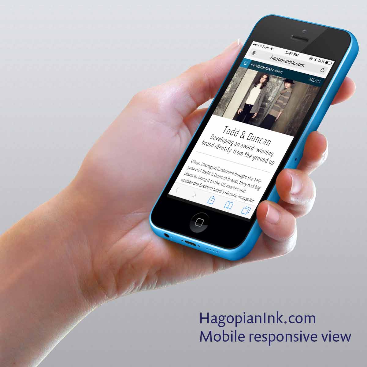
Other tasks included adapting the interaction design and menus for responsive breakpoints; researching and customizing plugins to do things that weren’t available out-of-the-box. Finally, we tested the prototype extensively, across a supported set of operating systems, devices and browsers.
The Results
Even with the relative added weight of webfonts and animated GIFs, the site loads remarkably quickly on mobile devices, even over 3G, using static image fallbacks to decrease perceived loading times, Part of the speed boost also comes from WPEngine’s speedy caching system.
The response has been phenomenal: Since launch, the site’s bounce rate has been remarkably low and visitor stats show increased engagement. It’s helped Hagopian Ink win some major new clients – which you’ll see added to the site in the near future.