I joined Hitachi ID Systems in 2017 as their first full-time UX designer. I worked on creating a new visual language, flows, wireframes, and high-fidelity prototypes, and used CodePen to do small interactive mockups.
Hitachi ID Systems (HIDS), now known as Bravura Security, makes enterprise software for Identity and Access Management (IAM). Their software is used by over 1,000 mid-size and enterprise organizations, to securely manage access across different systems and applications.
The product suite manages logins, restricts access to high-privilege accounts, and provides group-based access to resources, including single-sign-on (SSO) access to web-based applications, network hardware, VPNs, and even physical access via proximity cards.
In 2017, after being in business for nearly thirty years, HIDS had many large enterprise, financial and government clients, as they had built a reputation over 25 years of being able to take on challenging projects involving legacy systems. However, the highly engineering-driven nature of the company meant that the user interface and usability of the product had been deprioritized over implementing customer-requested features.
This didn’t go unnoticed, as newer competitors had entered the marketplace with more modern UIs, which made HIDS’ products look and feel dated and suffer by comparison in industry reviews. Things had to change.
I joined the small front-end team as the company’s first full-time user experience designer, and got up to speed on what clients needed and how the current product suite worked.

Layout Framework
Over the years, several front-end frameworks had been used, from MooTools to jQuery, and now, the goal was to create a modern, component-based front-end using Angular, the Javascript-based front-end framework from Google. It seemed logical to go with Angular Material, an implementation of Google’s Material Design in Angular, to give us a simpler path towards a modern UI.
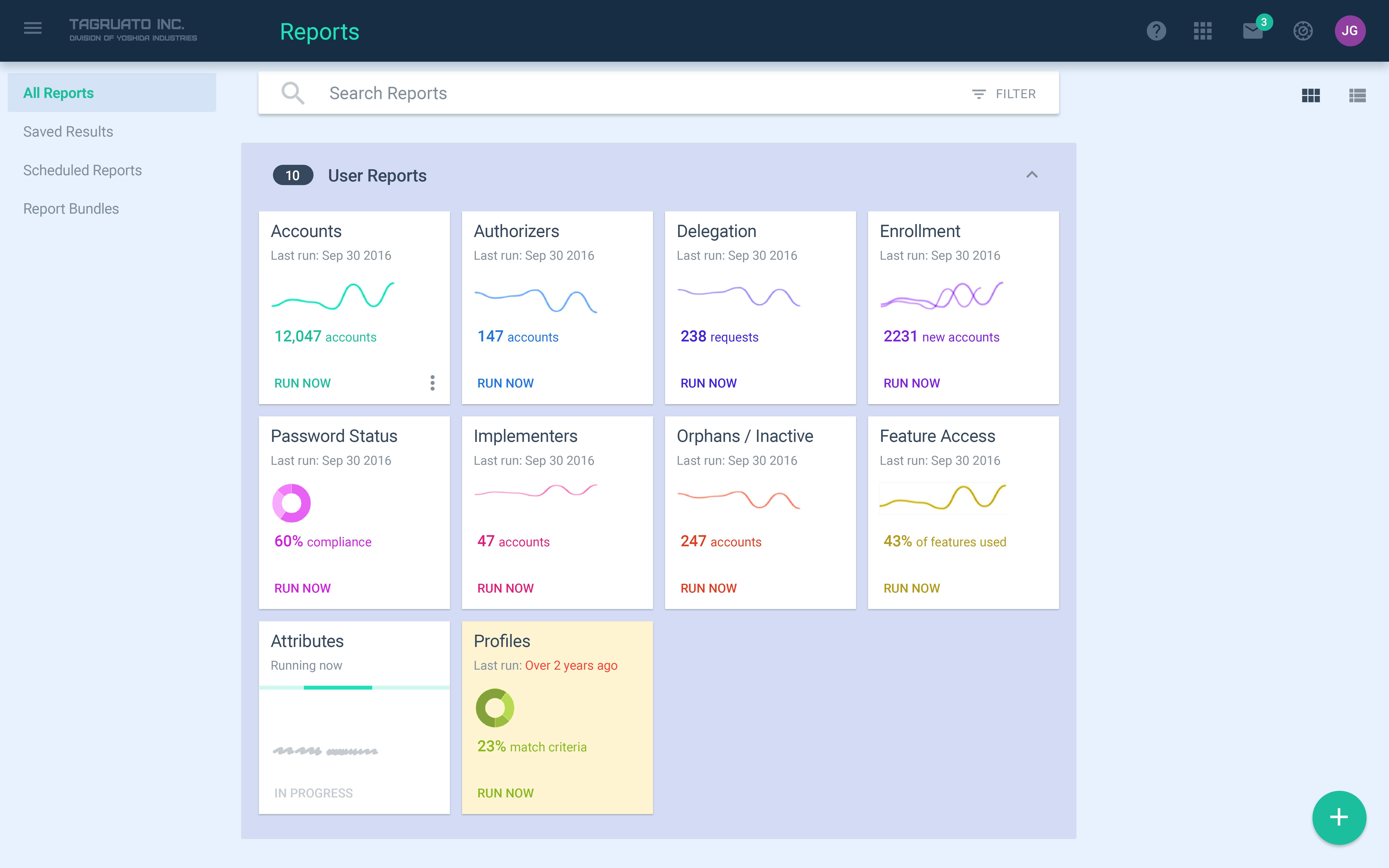
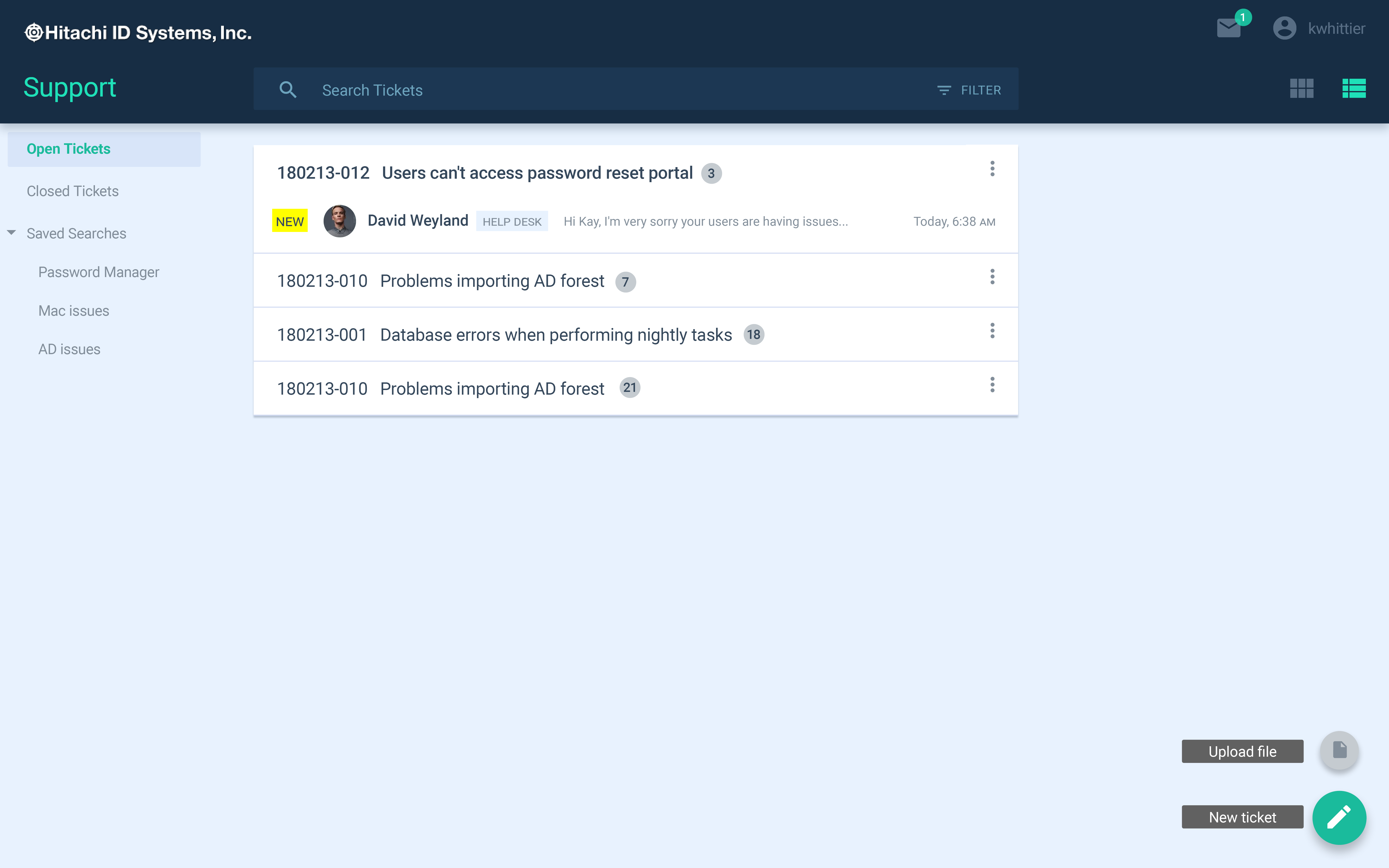
Using Material Design’s twelve-column framework for desktop and its four-column framework for mobile, I wireframed several conceptual layouts, encompassing a top main navigation and search bar, left-side subsection navigation, and a columnized, card-based central content area, with space on the right side for contextual editing and information overlay panels.


Gallery: Layout grids and card details for desktop.
Typography & Color
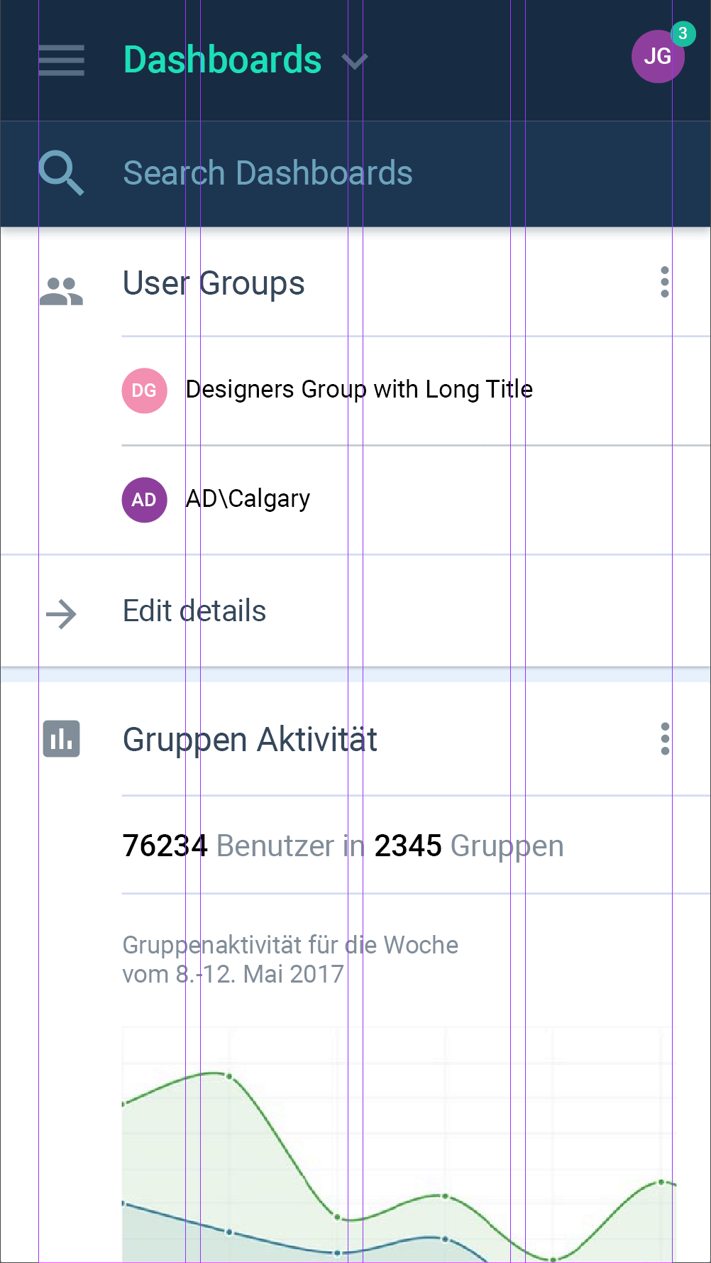
The designs combined Material visual styles with custom components. The initial designs were created using the Roboto typeface, and the colour scheme used the legacy product’s teal blue, extended into a series of shades from dark to light, implemented as a set of SCSS color variables and functions for our coders to use.
Gallery: Design system in use
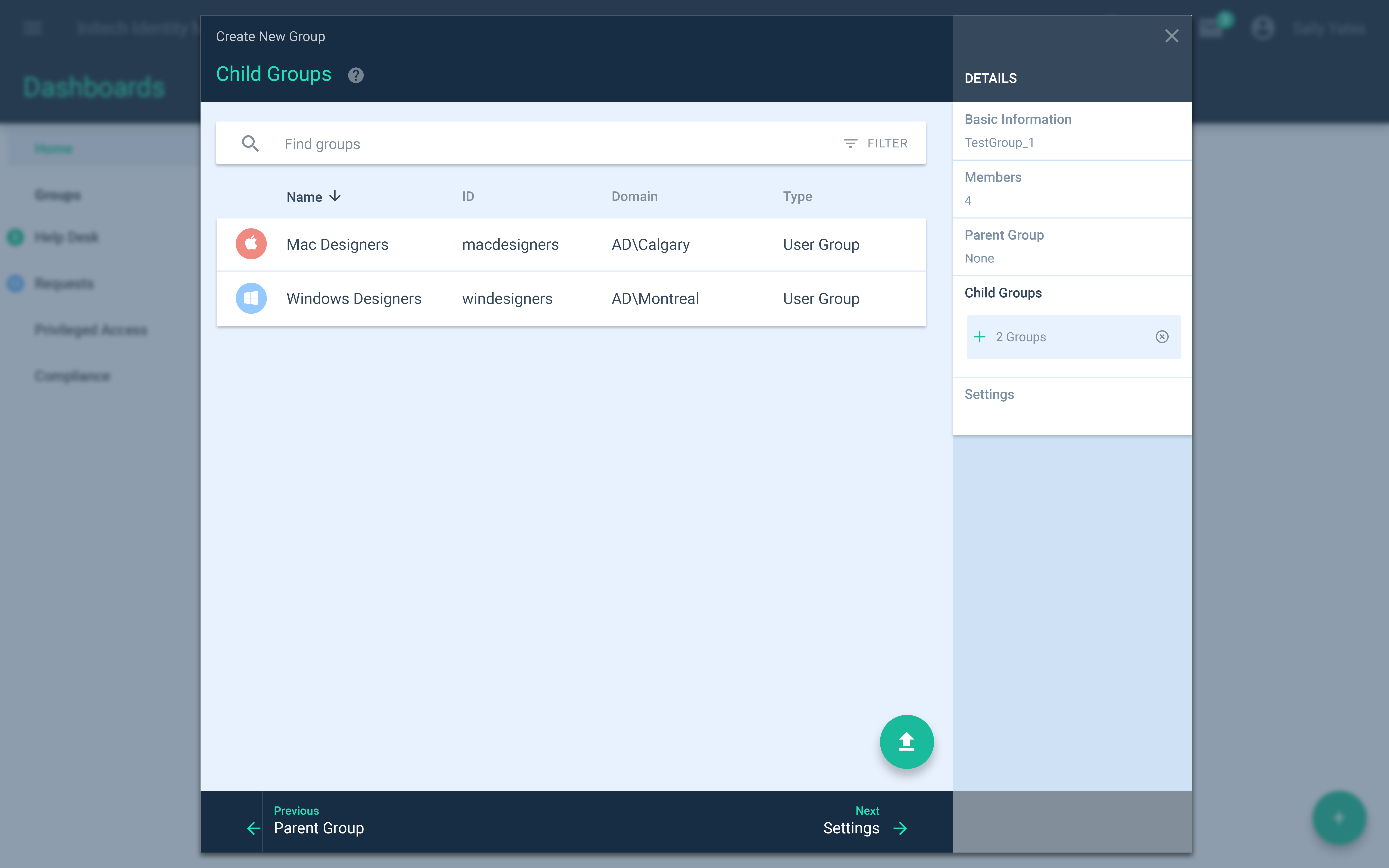


Wizard Flows


Gallery: Opening a new wizard from a Floating Action Button (FAB)
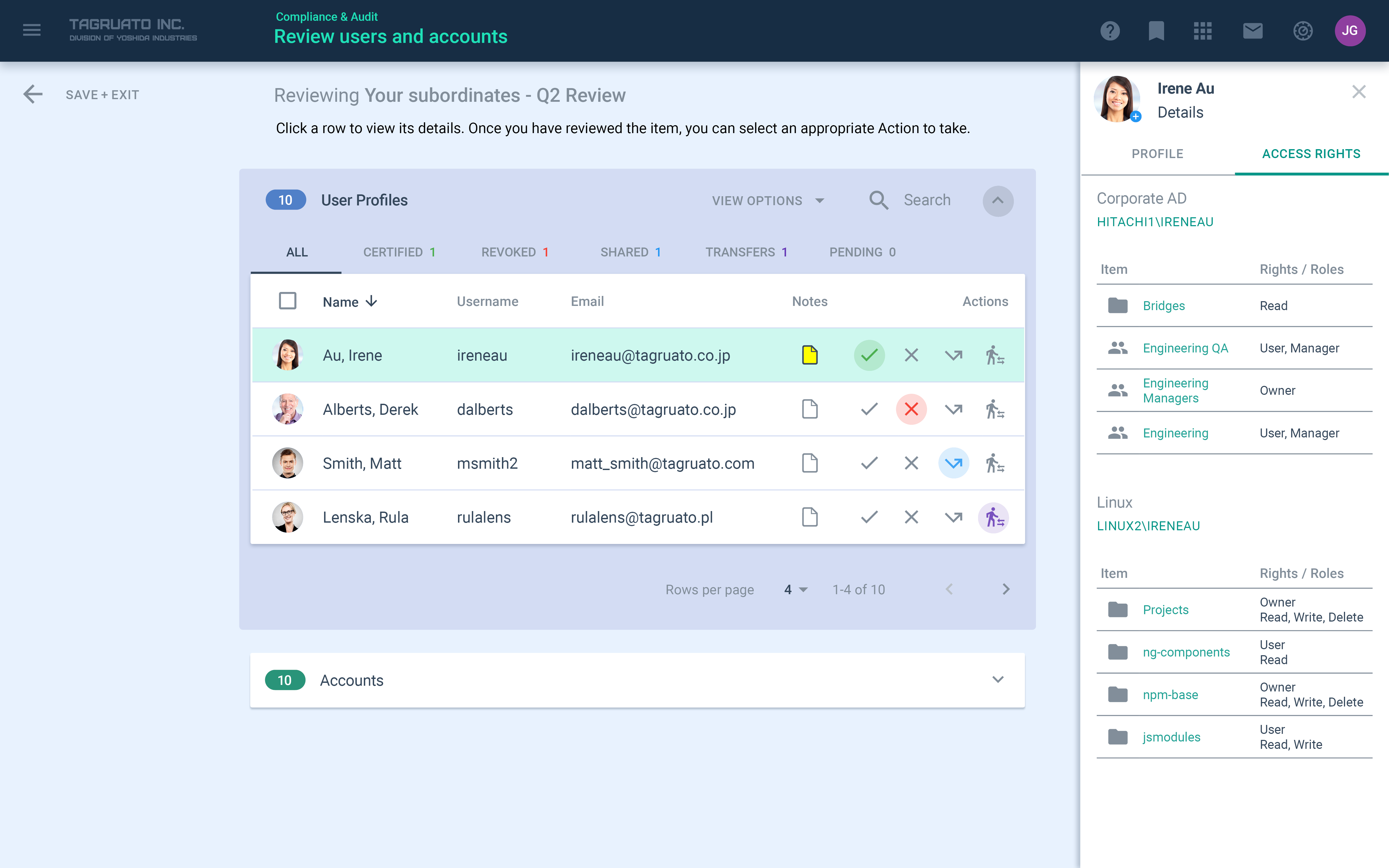
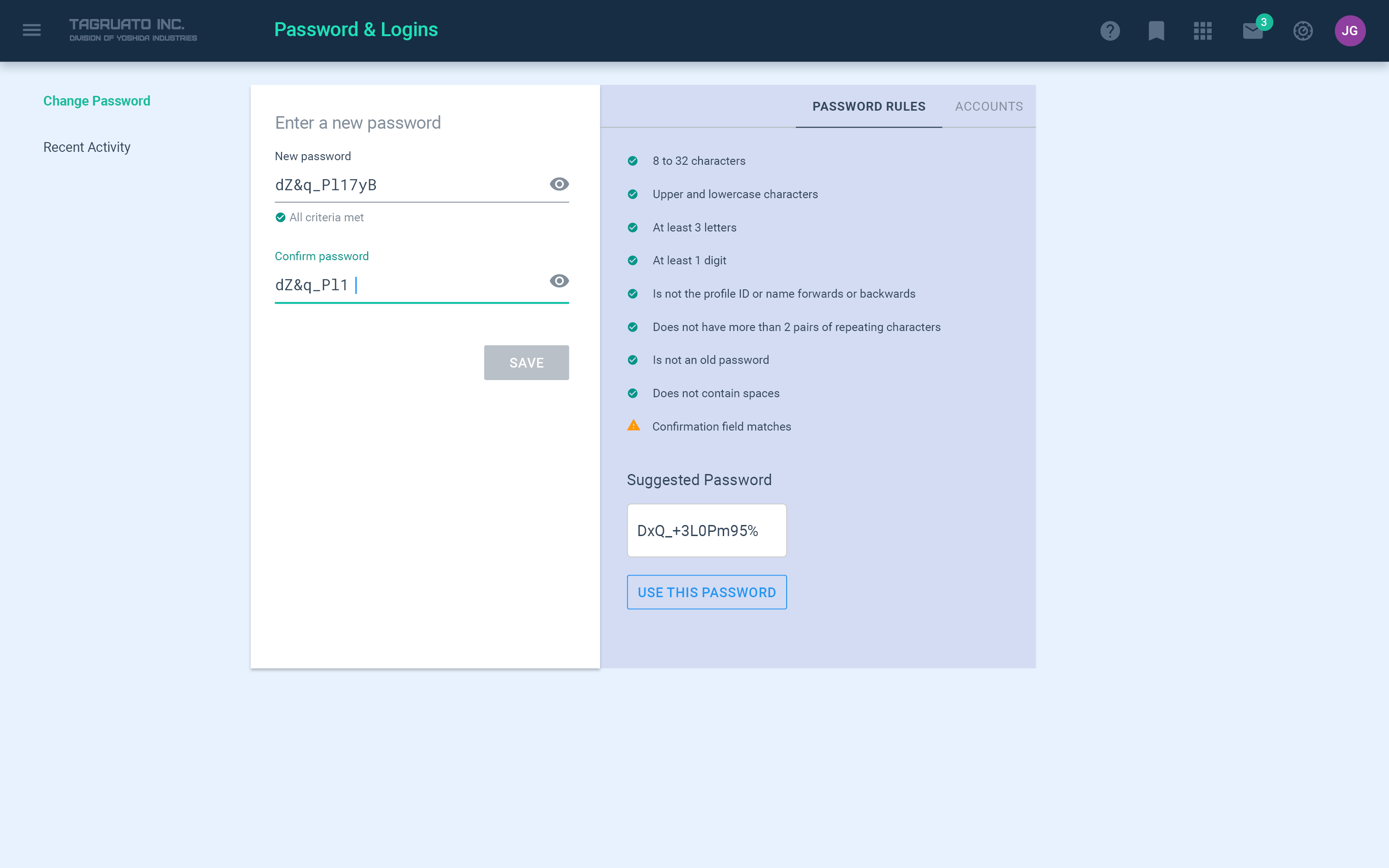
Much of the redesign work focused on making the interface less “clicky” – that is to say, removing a lot of nested text links within other objects, and making action flows more obvious and clean. We approached this through the lens of using contextual action menus wherever possible, and multi-step wizards, using a “cart and checkout” paradigm.
Since many of these actions required manual approval, they weren’t completely automated, but we designed flows to intelligently offer only permitted options, to prevent user errors. These wizards (with a different visual design) were implemented throughout the product suite.
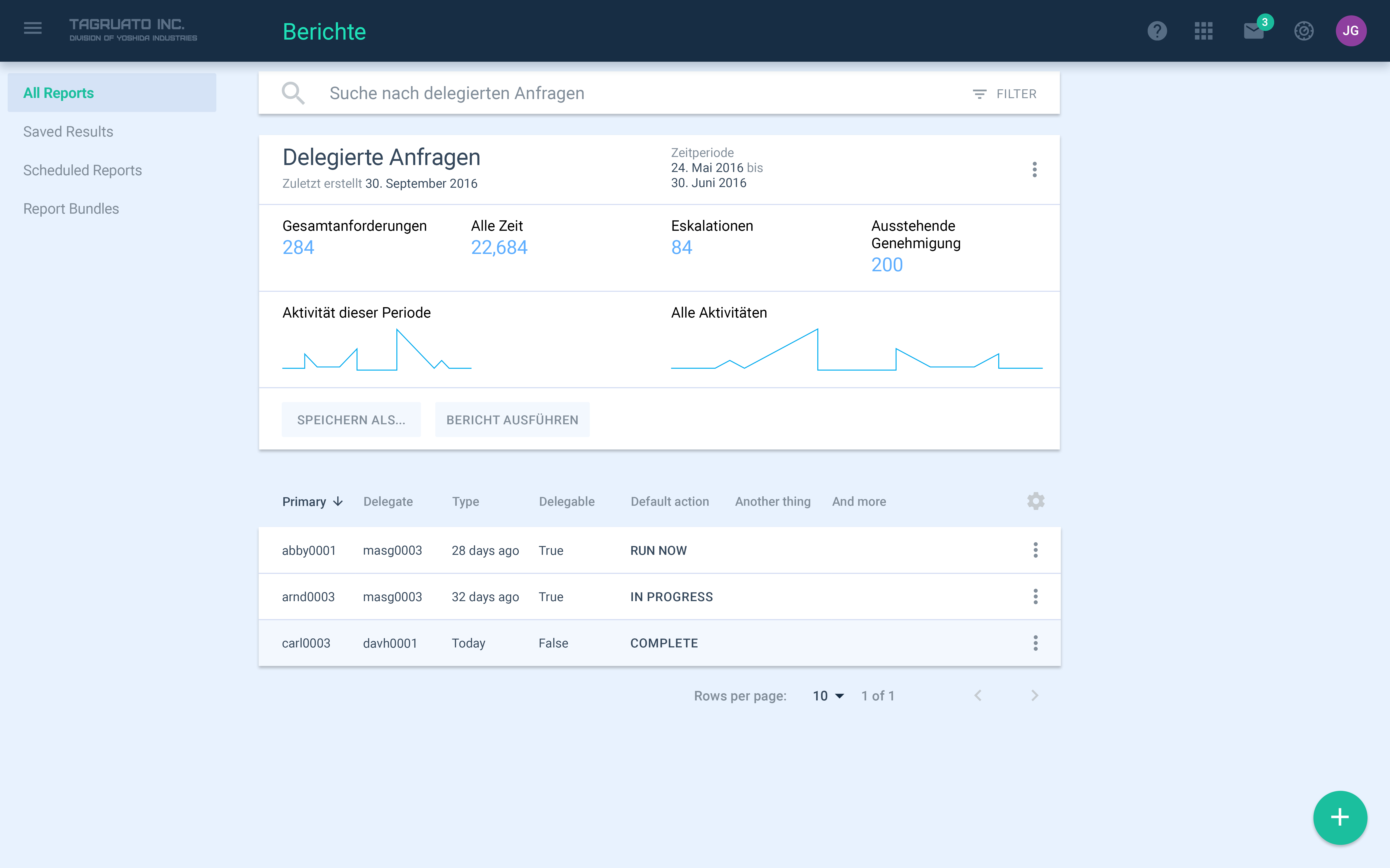
Further designs were created to explore different options for dashboards, providing a quick overview of statistics and notifications.