In 2022, I was a Senior UX Designer with Cubeler, a Montreal-based B2B startup that provided a pairing system for small businesses and lenders, as well as business networking and advertising services.

The major part of my work was drafting the Figma component library / design system, along with a team of three junior designers, supervised by the director of user experience.
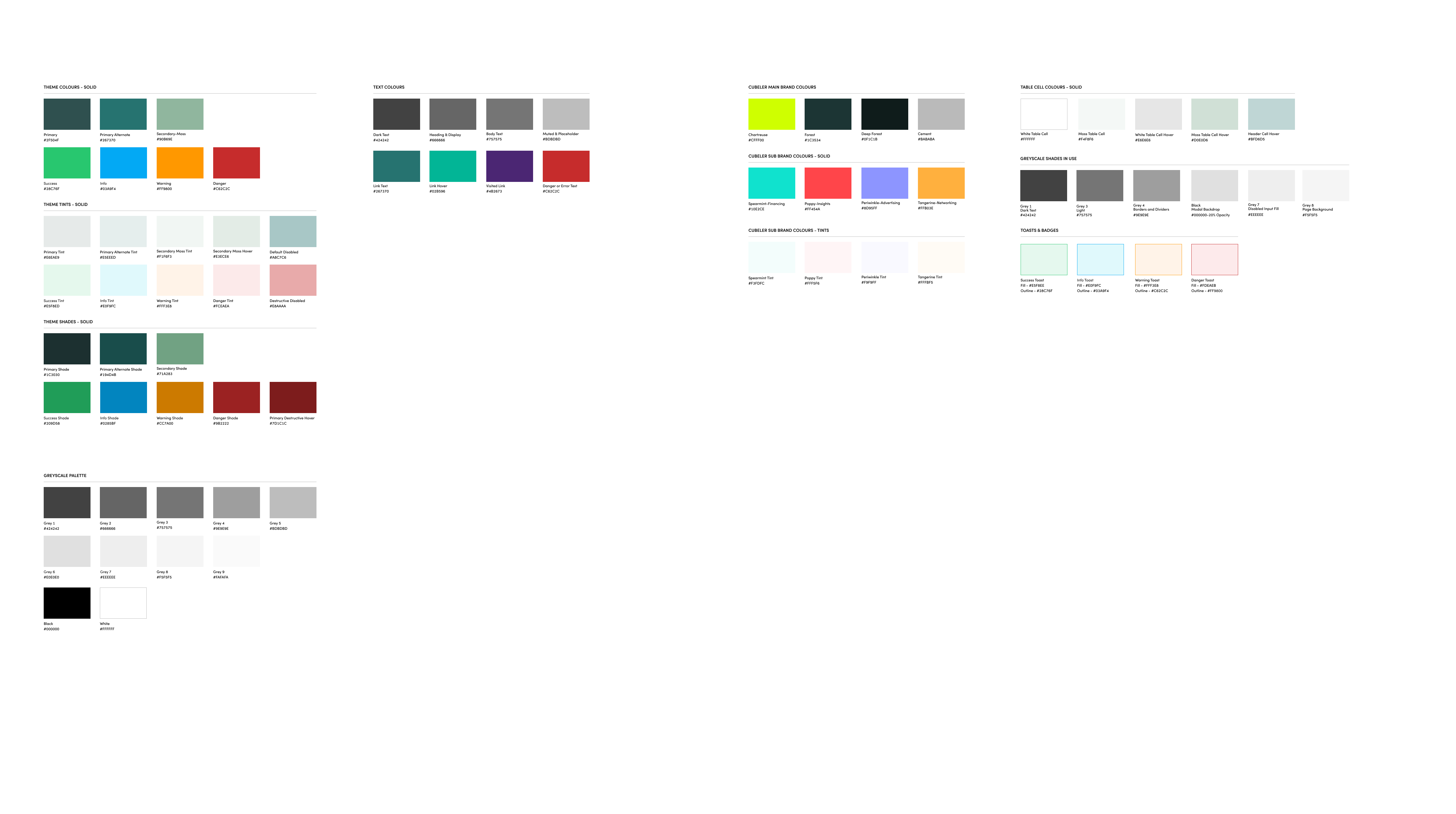
The Cubeler system included states for all interactive components; typography, icons, and colors; plus layout grids and specification diagrams.
Several of the colours were derived from the official branding scheme, but adapted for on-screen use and given sufficient contrast to meet WCAG AA recommendations.
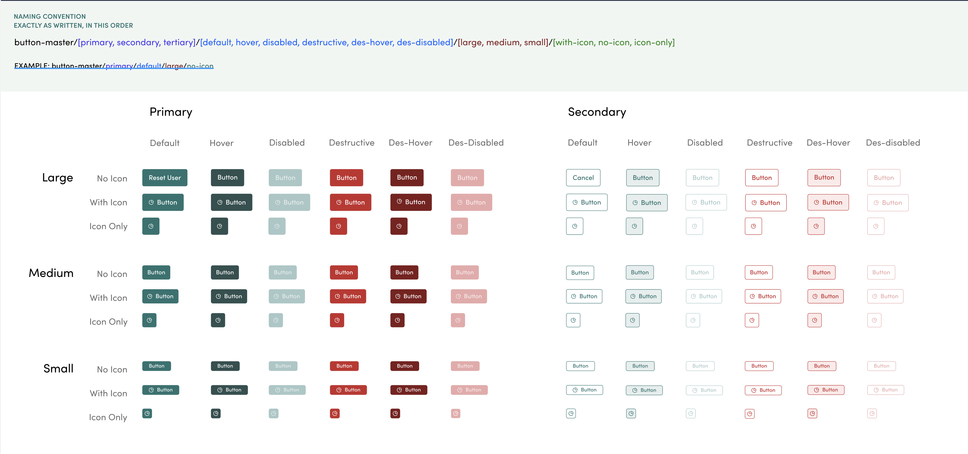


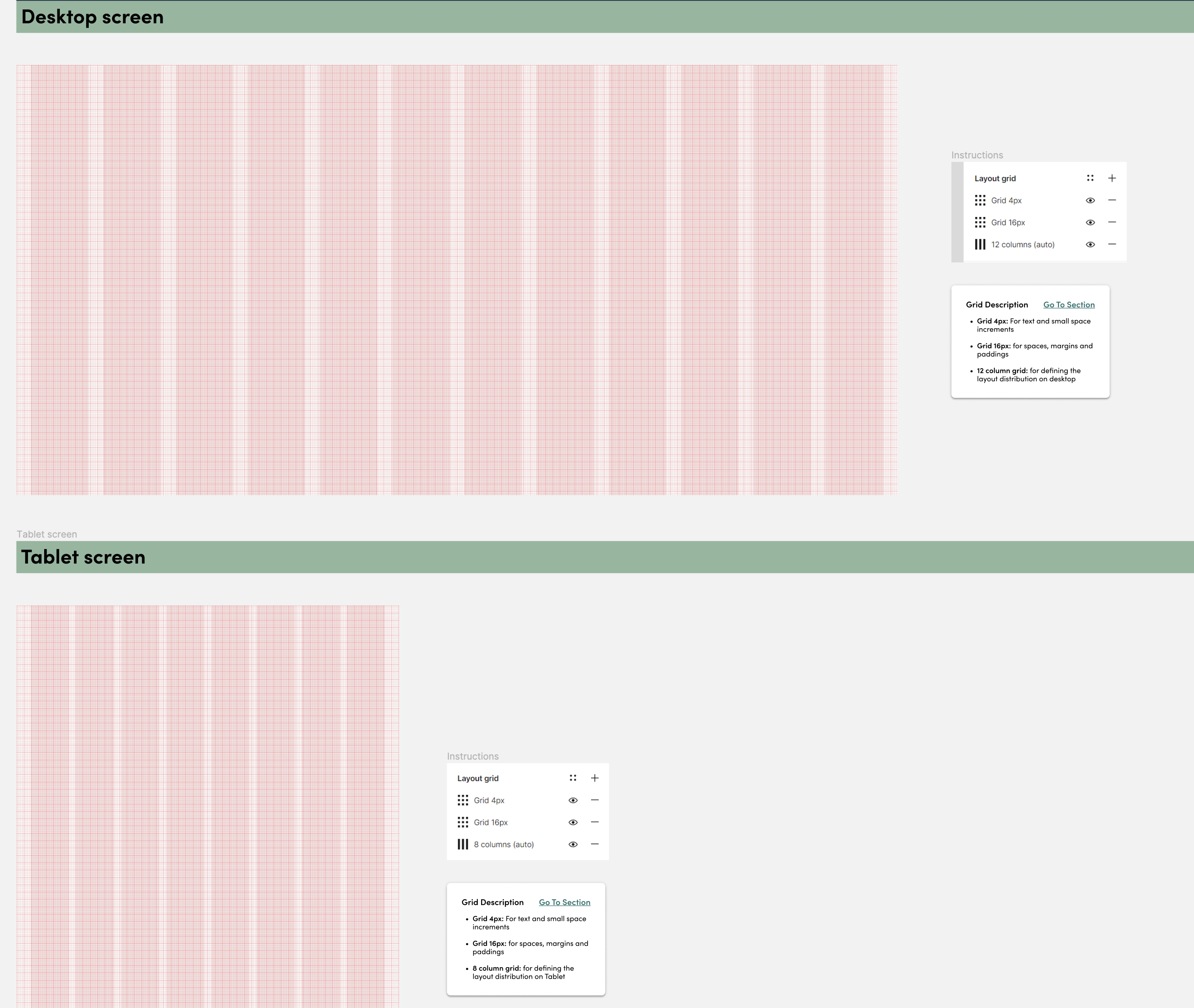


Gallery: A small selection of components and styles from the Cubeler Figma design system.
Flows
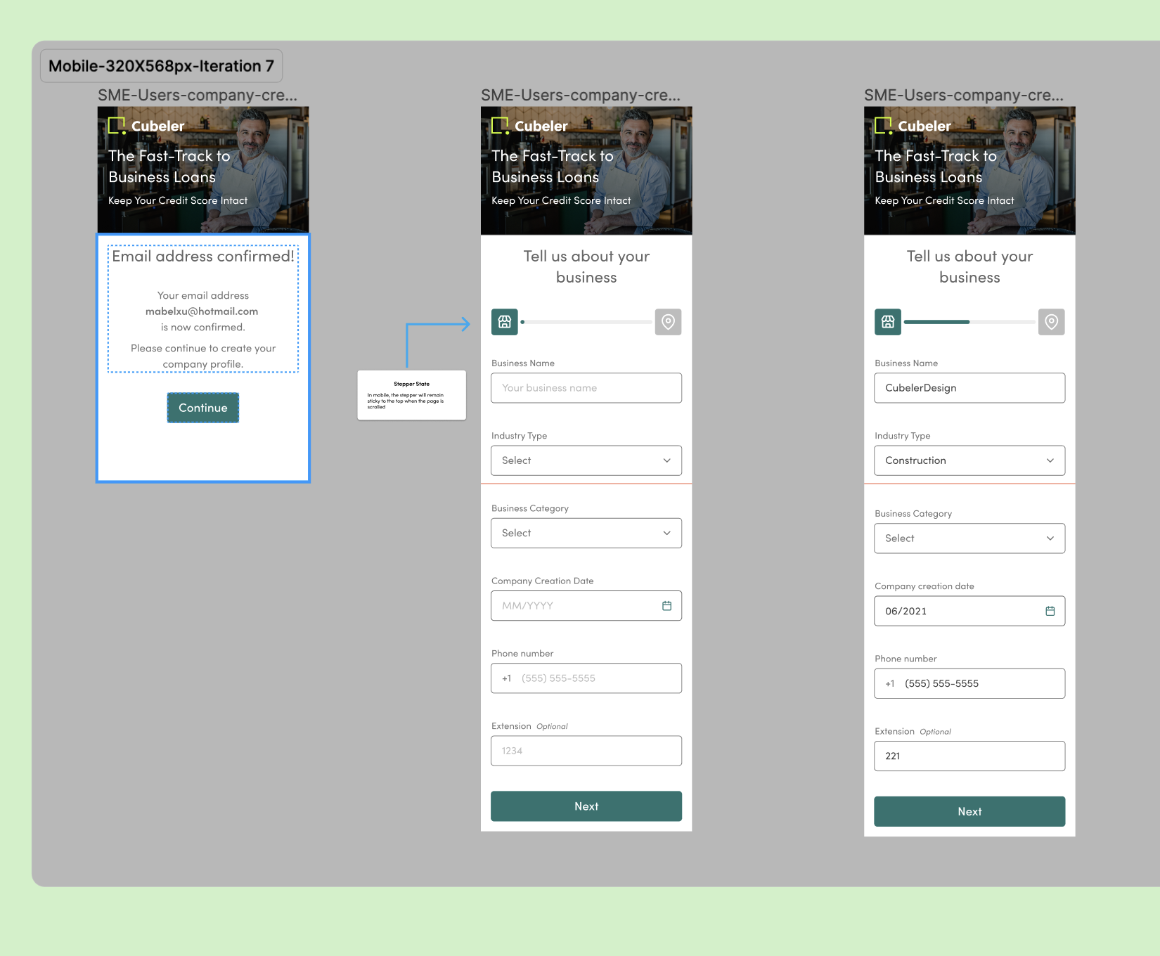
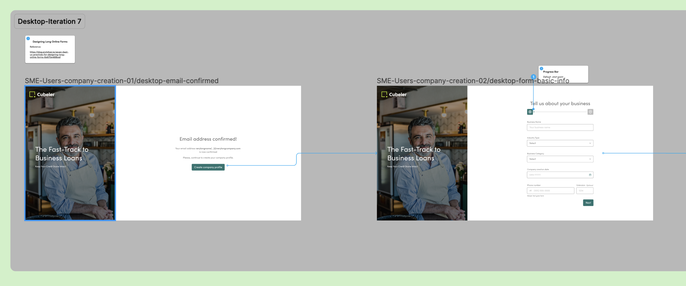
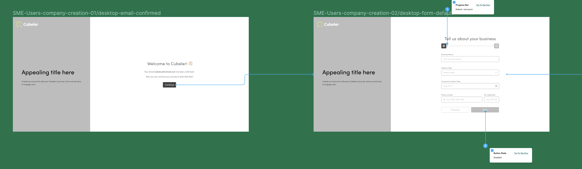
With work on the design system happening in parallel, the team and I worked on several interaction flows for the launch version of the site, such as the sign-up and company registration pages, settings pages to enable companies to add employees as users, managers or admins, and so on.
For each of these flows, we created diagrams for each flow, often with simplified notation of page content, and denoting error states and alternative paths based on user choices.


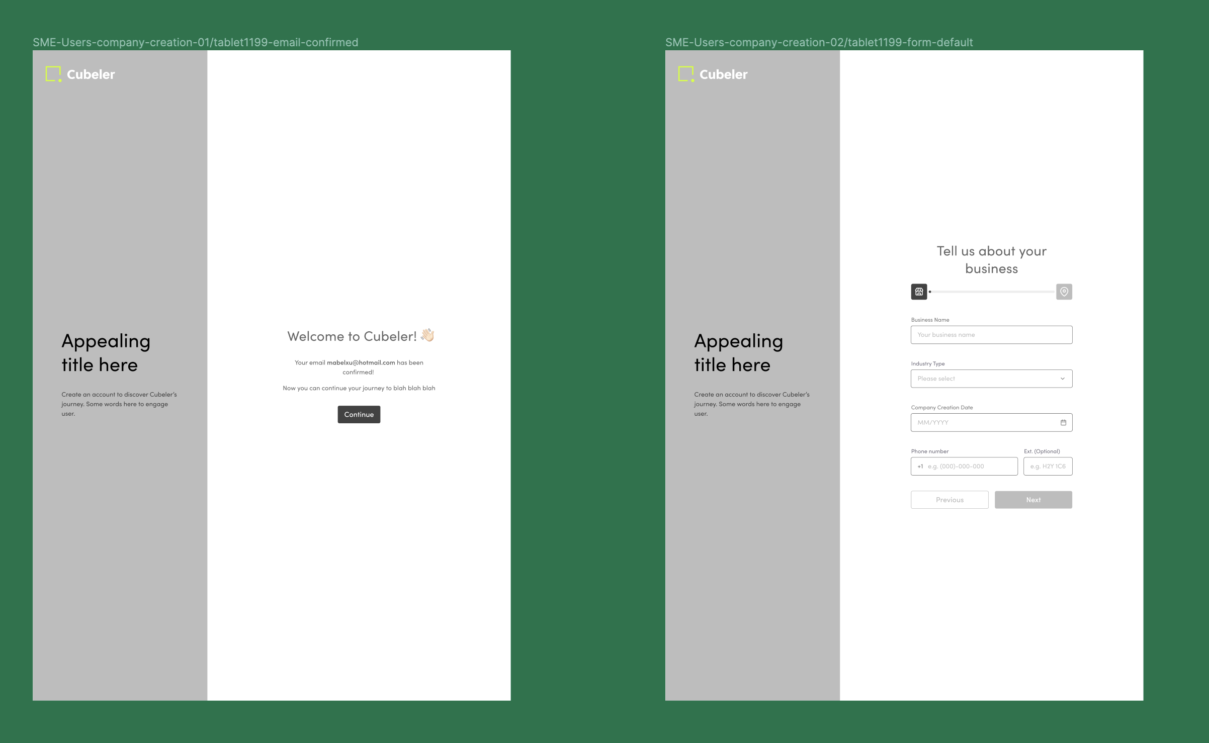
Wireframes
From the flows, each sequence of screens was laid out in simplified wireframes with black-and-white graphics, with variations for mobile, tablet, and desktop layouts.

Mockups
Collaborating with the Marketing team, we populated the wireframes with appealing photography and finalized the look and feel.